
So, you’ve done all the work ahead of time: nailed an excellent presenter, crossed the t’s and dotted the i’s in your beautiful PowerPoint deck, practiced boatloads of times and had a flawless webinar. You encouraged participants to submit their lessons learned and questions over Twitter, but now you’re wondering what did that really accomplish? What kind of social impact did it reach? Is it worth even doing again?
You’re in luck, because you can easily analyze the magnitude and impact you made without any fancy or advanced analytics tools. With access to your Twitter account, its back-end analytics and a little knowledge of Excel, you’ll have all the data you need to demonstrate the reach, Impressions and potential web traffic through a few simple steps.
(1) Name your hashtag
First, make sure you plan your tweets ahead of time and have a hashtag ready for use. This is useful for your own reporting but also helpful for your Twitter users. Just pick a hashtag, stick with it and promote it during your event.
(2) Host your webinar
Next, host your webinar as you normally would, live tweet, engage and interact with attendees. This is the important part! Tweet as you would for any other webinar, but this time we’ll be able to analyze your effectiveness.
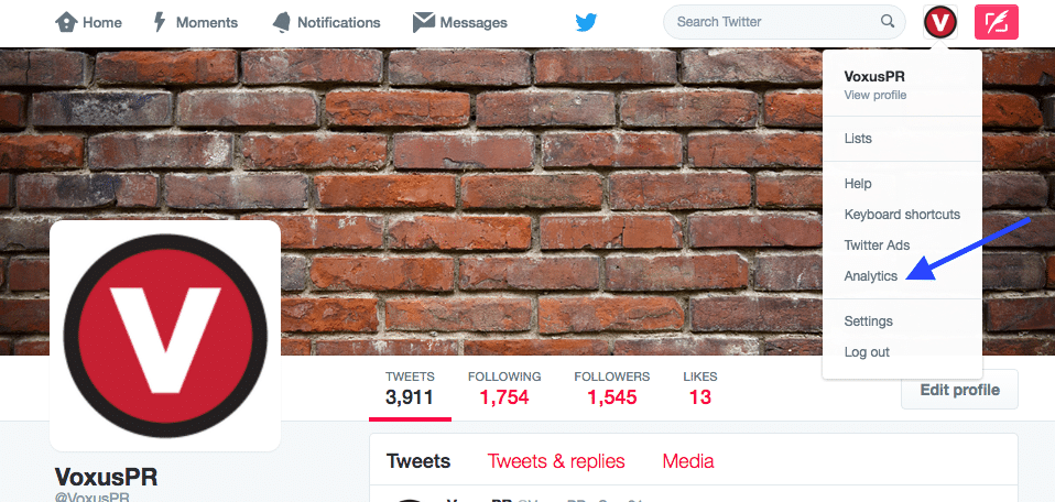
(3) Download your Twitter Analytics data
Now for the good part: go to your Twitter account and access your Tweet analytics. Or simply visit this page: https://analytics.twitter.com.
Once there you’ll want to navigate to the ‘Tweets’ tab of this analytics view. Download your data from the date range that would include the tweets from your webinar.
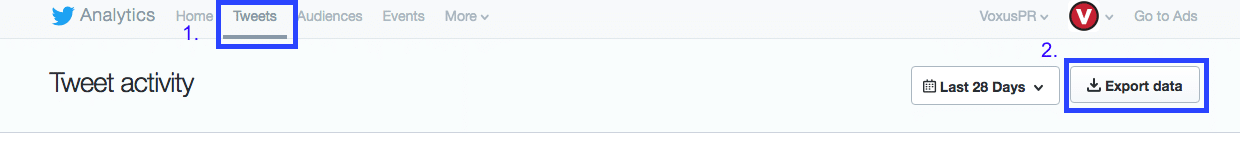
This will provide you with a CSV file. If you’ve never downloaded this file before, you’re in for a real treat! There is a lot of data in here that you can sort, analyze and manipulate. You can use this file to analyze just about anything about your tweet activity, not just webinars.
(4) Use Excel to pull webinar-specific tweets
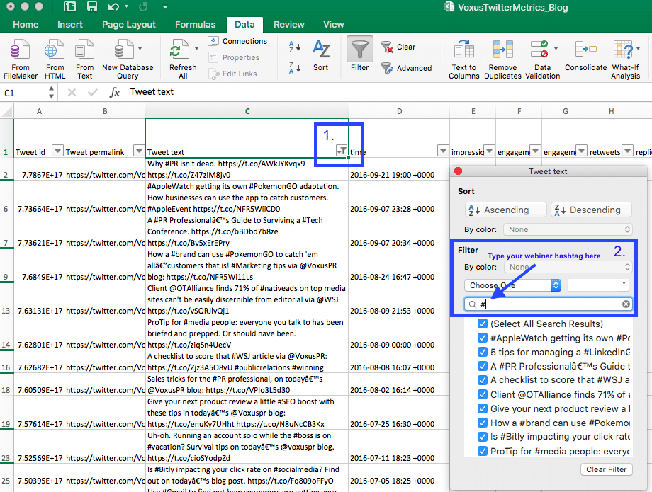
From here, open the CSV file. You’ll see most of the same data you have in your Twitter analytics dashboard, but now you can analyze it. Here’s where your Excel skills come in handy. Make the data functional by turning on the sort/filter (using tip 2 of this blog post). Group all the tweets that include your hashtag by searching for the hashtag in the filter search bar, as illustrated below:
(5) Analyze!
Now that you have all your webinar tweets organized in one place along with the data, you can start analyzing. Copy the current set of tweets in your view into a new sheet (as Excel mathematical formulas don’t work when you have hidden rows). From there you can analyze things like:
- Total impressions
- Link clicks
- Engagement rate
- Retweets
- Likes and more
You can analyze any metric available to you in the top row of this CSV file. And you can use any Excel function to analyze it (sum, average, count, min/max, and more) and subsequently turn that data into charts using Excel or PowerPoint’s chart functions.
There’s more to analyze than just your own profile, you’d probably like to look into external mentions and use of the webinar’s hashtag by other Twitter users. Unfortunately, without advanced analysis tools, you’re stuck using the Twitter search and notification page for most of this information. But this small tutorial will have you headed in the right direction. One thing worth noting is that most social platforms have or are working toward these downloadable formats for their insights/analytics. Facebook and LinkedIn’s ad platform have similar functionalities.