You don’t have to be an expert in advanced calculus to measure results. All you need are some basic Excel tricks to create robust reports for your clients. Now, more than ever, we get asked to scale up, do more with less and demonstrate the value of our work through data and reports. Here are a six basic Excel tips and tricks to get more from Excel.
Math: Skip the calculator and use Excel
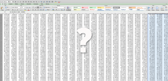
Combining several data sources into a single report and need to crunch the numbers? Put away the calculator and drop those numbers into an Excel spreadsheet (it’s even better when you can copy and paste). Excel is a much better calculator; you can check and double check your numbers without working the 10-key all day. All you have to know is a few basic formulas, which are fairly intuitive:
- Sum: Adds all the numbers in the range of cells you specify
- Average: Averages all the numbers in the range of cells you specify
- Percent Change: Okay there’s no distinct formula for this but it’s a simple calculation you should already know and love, use this in the formula bar = (New Data – Old Data)/Old Data.
Pro tip! If you build a column of data using formulas of you copy and paste those values remember “paste values” if you don’t it will copy and paste the formulas with mismatched data and the dreaded ‘#REF!’ appears.
Sort and filter
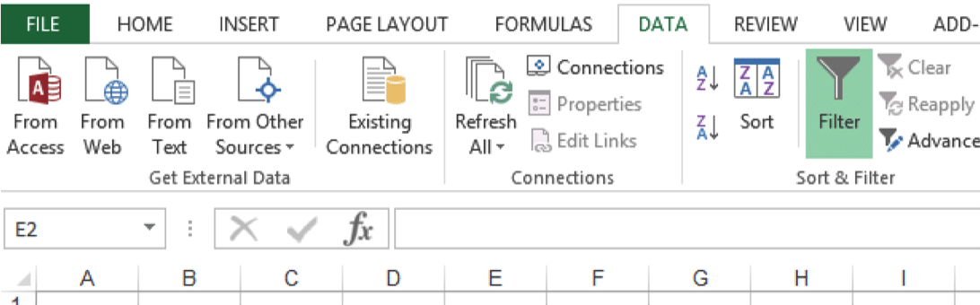
Sort is hands down the best feature in Excel. If I’ve opened Excel on any given day, there’s a 99% chance I’ve used sort. Whether you’re sorting a list of contacts, prioritizing PR wins by date or prioritizing a list of tactics and strategies, the sort and filter tool is vital. Important things to remember – if you want to sort one column while maintaining corresponding records in the same row you must select your data fields properly. To do this you can either highlight the entire field of data or highlight the top row of your data field (and ensure your there are no breaks in your data), and select the funnel button (image above) to set your specified data section.
Once the data field is specified, click the drop down button in the column you want to sort. At that point you can sort (by alphabet or count) or filter by cell color, text or free form search.
Prerequisite Skill: Formatting

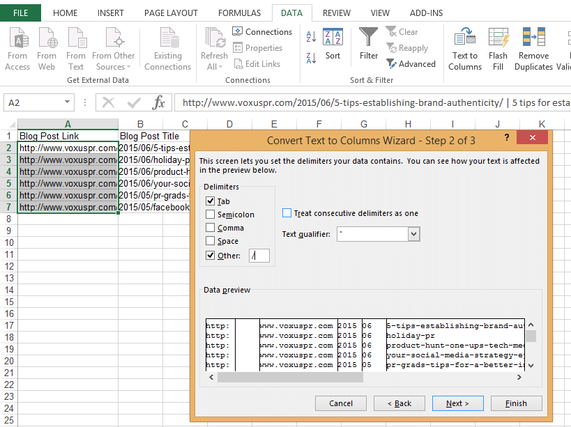
Text to columns
Pivot tables
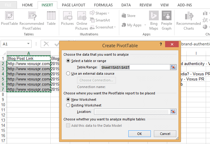
Now that the basic functions are out of the way we can get into reporting. Pivot tables are great if you have a massive set of data or if you need to provide a 10,000 foot view of a list of items. Highlight the selected data you want to analyze and under the “insert” tab, click “Pivot Table.” A new worksheet will be generated and a window will pop open with a new tool: “Pivot Table Fields”. It’s not immediately intuitive, but you can drag and drop values into this new tool. If you have time to play around with the data, just start dragging and dropping values. When you put data in the “Σ Values” you’ll start to see your data come to life.
Building graphs and charts
Pivot tables have you organizing data and finding trends, what’s the best way to present that data? Charts. You can start easily building charts directly in Excel, but I typically find that I’m presenting data in PowerPoint. You can cut the middle man because chart data is now editable in Excel – just start a chart in PowerPoint and paste your data into the Excel chart data.
Conditional formatting
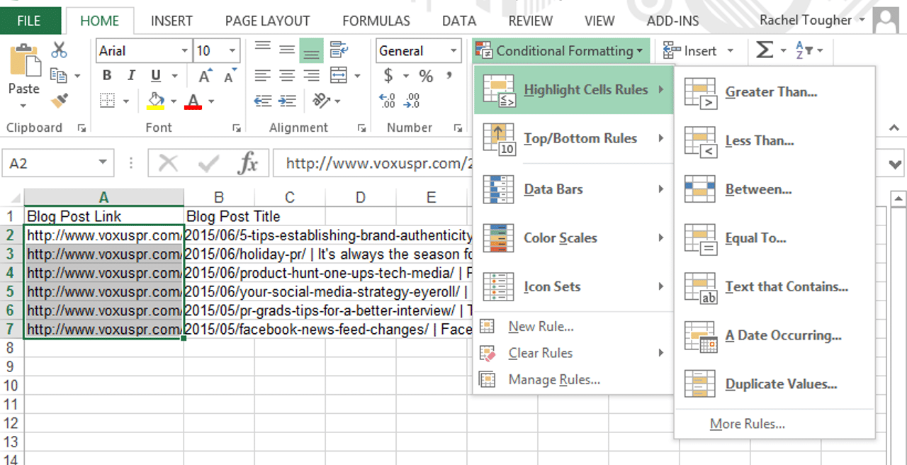
Want to find specific data without sorting? Perhaps you’re in a contact list and you want to review any duplicate contacts before resorting to the “remove duplicates” button. Conditional formatting is a great aid – you can do a lot of things with this tool but my favorite function is highlighting cells based on conditional specifications (like duplicate values or cells containing a specific phrase).
If you’re looking for more advanced tips and tricks, Vlookup, ‘IF’ specifications and concatenate are formulas that have really helped me save time manipulating data and organizing data for reports.